Ever notice how the most exciting tech today-spatial headsets, biomorphic wearables, fluid dashboards-looks more like high-performance architecture than old-school gadgets? That’s not a coincidence. It’s Neo-Futurism showing up in product and interface design. If you’re here to understand what this movement actually is, why it’s powering modern tech, and how to use it without sliding into sci‑fi cosplay, you’re in the right place. You’ll get principles that travel well across hardware and software, a step-by-step playbook, examples, checklists, and answers to the awkward questions (costs, risks, regulations). Expect clarity, not hype.
Jobs you likely want to get done after clicking this:
- Define Neo‑Futurism in a way a tech team can use on Monday.
- See practical steps to apply it across hardware, UI, and brand.
- Spot real-world examples and what makes them work.
- Use checklists, heuristics, and decision rules to avoid gimmicks.
- Understand trade-offs-cost, manufacturability, accessibility, longevity.
- Leave with next steps tailored to your role (PM, UX, ID, founder).
Neo‑Futurism in tech: TL;DR, clear definition, and why it matters now
TL;DR / Key takeaways
- Neo‑Futurism treats tech like living infrastructure: form driven by performance, fluid geometries, sustainable materials, and interfaces that feel spatial, contextual, and calm.
- It’s not just a look. It’s a method: parametric systems, simulation-led decisions, and human‑centered standards baked in from day one.
- Use it when you need advanced performance, clarity in complexity, and a brand language that scales across products and screens.
- Beware: complex forms can inflate costs; spatial UI can overwhelm. Counter with constraints, modularity, and ruthless usability testing.
- Success metric: your product feels inevitable-like it couldn’t have been shaped any other way-and it ages well.
What Neo‑Futurism is (for tech teams)
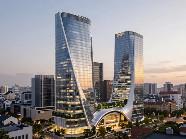
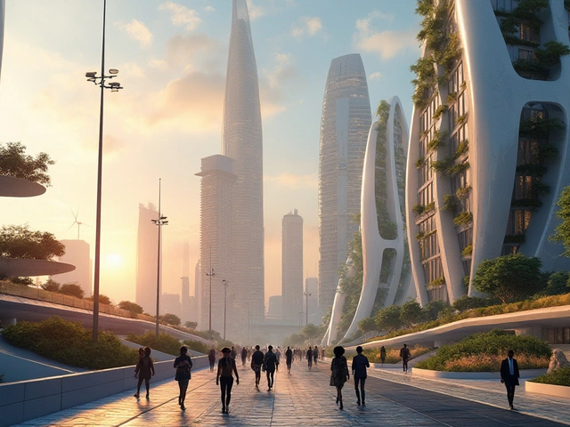
Architects like Zaha Hadid, UNStudio, and Santiago Calatrava pushed a design logic where form follows performance: flows of people, loads, light, air. In tech, that becomes data paths, heat, signal, grip, glance. Neo‑Futurism translates these flows into optimized, often parametric geometries and interfaces. Expect smooth transitions, curved edges that guide touch, dynamic lighting that communicates state, and surfaces that hide complexity until you need it. It’s not ornamental; it’s operational beauty.
Why it’s taking over in 2025
- Software and fabrication matured: Rhino/Grasshopper, Houdini, Fusion 360, and generative solvers make non‑trivial geometry cheap to explore. Five‑axis CNC and multi‑material 3D printing make it buildable.
- Interfaces went spatial: AR/VR and depth-aware phones need UI that behaves like architecture-layers, sightlines, wayfinding. Apple’s Human Interface Guidelines and Google’s Material You already hint at this.
- Sustainability is table stakes: You can’t bolt it on later. Life cycle thinking and material efficiency shape the form from the start.
- Brand pressure: In saturated markets, distinct yet purposeful forms are a moat. A recognizable design “grammar” helps you ship a family of products faster.
Core principles (use these as guardrails)
- Form follows performance: Every curve, chamfer, and micro‑interaction earns its keep. If it doesn’t improve grip, airflow, latency, or comprehension, it’s out.
- Parametric consistency: Define variables (radii, spacing, frequency of vents, animation timing) and reuse them across hardware, UI, and brand.
- Human‑in‑the‑loop: ISO 9241‑210 style: research, prototype, test, iterate. The “future” should be easier, not cleverer.
- Sustainability by default: Modular repair, recycled materials where it matters, low‑power display modes, and end‑of‑life plans.
- Calm expressiveness: Dynamic feedback that’s legible at a glance-light, haptics, subtle motion-without noise.
How it differs from look‑alikes
- Minimalism: Fewer parts, flat planes. Great for clarity; can hide complexity you actually need. Neo‑Futurism keeps clarity but shapes flow.
- Brutalism: Raw, unapologetic blocks. Honest, sometimes hostile. Neo‑Futurism is softer, more ergonomic, and performance‑tuned.
- Retro‑futurism: Nostalgia for futures that never happened. Fun, but risky for longevity. Neo‑Futurism is forward without cosplay.
Your tool stack (2025)
- Geometry and simulation: Rhino + Grasshopper, Houdini, Fusion 360, Ansys for FEA/thermal, Autodesk CFD. For UI, Framer + Figma variables, ProtoPie for hardware‑linked interactions.
- Fabrication: SLS/MJF printing for nylon/TPU, 5‑axis CNC, multi‑shot injection molding, PCB antenna simulation tools, elastomer overmolding.
- Evaluation: Usability per ISO 9241‑11, accessibility per WCAG 2.2, LCA per ISO 14040/44, safety per IEC 62368‑1/60601‑1 (category‑dependent).
| Aspect | Metric | Typical 2025 Range | Why it matters | Primary Source |
|---|---|---|---|---|
| Recycled Aluminum vs Primary | Energy use | ~5% of primary energy | Massive CO₂ reduction; supports slim yet strong housings | International Aluminium Institute |
| LED Efficiency | Luminous efficacy | 150-220 lm/W (high‑end) | Enables low‑power, legible dynamic lighting cues | NREL lighting reports |
| 5‑Axis CNC vs 3‑Axis | Cycle time for complex parts | 20-50% faster for multi‑face ops | Makes continuous organic forms economical | Industry machine tool benchmarks |
| Multi‑Material Printing | Prototype lead time | 1-3 days for functional assemblies | Early test of grips, flex zones, living hinges | VDI 3405 additive guidelines |
| Usability Targets | Task success / time‑to‑first‑action | >90% / < 3s for key tasks | Prevents “futuristic” confusion | ISO 9241‑11 framework |
| LCA Scope | Stages covered | Cradle‑to‑grave (A-D) | Avoids shifting impact to end‑of‑life | ISO 14040/44 |

How to apply Neo‑Futurism: a practical playbook with examples
Step 1: Frame outcomes, not “aesthetic”
Write three non‑negotiables tied to performance and experience. For a wearable: “Comfortable for 12 hours (thermal skin contact <33°C), glanceable status at 1m in daylight, 2‑meter drop survival.” For a finance app: “Funds moved in <10s, ambiguity‑free states, single‑tap reversal within 60s.” These become your North Star. If a design flourish fights them, it’s gone.
Step 2: Set a parametric system
Define variables that govern your geometry and UI so changes ripple cleanly. Examples: chassis fillet radius, vent spacing frequency, maximum curvature, icon corner radius, motion easing values, shadow elevation steps, and light color temperature per state. In Figma, use variables and component properties; in Rhino/Grasshopper, expose sliders for the same numbers. Now your industrial and digital designs can move in lockstep.
Step 3: Simulate before you style
Use FEA to find where the shell can thin and where ribs should thicken. Run thermal CFD to place vents where flow wants to go. In UI, prototype task flows and measure time‑to‑first‑action. Bake these results into your parametric system so the “look” emerges from what works.
Step 4: Prototype with the right fidelity
- Hardware: Print nylon (SLS/MJF) housings with TPU grips. CNC a hero part to check reflectivity and seam behavior.
- Lighting: Test LED brightness, diffusion films, and PWM flicker. Set color temperatures by state (e.g., 2700K calm, 5000K alert).
- UI: Motion prototypes at 60-90 fps, with real content and edge cases. Spatial UI? Validate sightlines with headset capture.
Step 5: Design interface like micro‑architecture
Treat screens as rooms. Use layers for foreground tasks and persistent background states. Add “structural” elements-grids that flex, wayfinding breadcrumbs, and lighting that guides attention. For spatial computing, keep interaction zones within a comfortable reach/eye cone. Borrow from wayfinding: consistent iconography, clear entry/exit points, and progressive disclosure.
Step 6: Make sustainability change the form
Don’t slap a leaf icon on the box. Use fewer fasteners and more snap‑fits that survive repair cycles. Prefer recycled aluminum for thermal mass without weight; use bio‑based polymers for non‑load panels. Design for disassembly: screws over glue where feasible; modular batteries with clear labeling. Document the bill of materials with recycling codes and end‑of‑life instructions.
Step 7: Nail the product family grammar
People recognize a family, not a single product. Use the same curvature language, LED logic, and motion timings across devices and apps. If your watch has a ripple light pattern for pairing, your app should echo it with a ripple animation. That’s how a brand feels coherent without a logo yelling.
Step 8: Validate like a skeptic
- Usability: ISO 9241‑11 metrics-effectiveness, efficiency, satisfaction. You want >90% task success and low variability.
- Accessibility: WCAG 2.2 AA at least. Test motion sensitivity-offer reduced motion toggles.
- Safety/EMC: IEC 62368‑1 for audio/AV/IT devices, IEC 60601‑1 if medical. Early pre‑compliance saves quarters, not weeks.
Real‑world examples (what to learn, what to avoid)
- Spatial headsets and spatial UIs: Depth, shadows, and parallax guide attention better than flat panels. Keep gestures low‑effort and discoverable. Avoid over‑dense HUDs; think room signage, not cockpit overload.
- Dyson‑style appliances: Transparent parts exposing airflow, helical geometries tuned by CFD. Translate that honesty: show the function, not just the shell.
- EV dashboards: Curved displays that wrap sightlines with minimal glare; ambient light that signals state of charge or navigation turns without words. Resist skeuomorphism-use light and motion sparingly.
- Nothing‑style phones with light glyphs: Lights as functional feedback (charging, notifications). Learn: map light behaviors to meaning consistently; provide a quiet mode.
- Wearables for endurance: Soft curvature at bony contact points; perforation arrays that align with perspiration zones. Thermal design comes first; aesthetics follows.
Heuristics you can use tomorrow
- 3‑2‑1 Rule for curves: A trio of primary radii (macro, meso, micro) keeps coherence: e.g., 16mm, 6mm, 2mm across hardware, icons, and cards.
- 30-60-90 Visual mix: 30% expressive elements (hero curve, signature light), 60% calm surfaces, 10% high‑contrast utility zones.
- One light, one meaning: Every color/animation maps to a single state. No rainbow noise.
- Reveal on intent: Hide complexity until the user’s last action demands it. Motion should explain, not decorate.
- Performance‑first veto: Any element that adds grams, watts, or milliseconds must pay rent with measurable benefit.
When to pick Neo‑Futurism vs other styles
- Choose Neo‑Futurism when your product needs advanced ergonomics, airflow/thermal performance, spatial UI, or a distinctive family grammar.
- Choose Minimalism when cost, speed, and legibility matter more than expressiveness; flat slabs can be perfect for utilities.
- Choose Brutalism for developer tools or industrial controls where raw transparency and inspectability beat softness.
Cost and risk trade‑offs (and how to avoid pain)
- Manufacturing: Organic forms can add tooling complexity. Mitigate with part consolidation, split lines in low‑visibility zones, and early DFM reviews.
- Timelines: Parametric systems take setup time. Save it back by reusing across SKUs and platforms.
- Accessibility: Expressive motion can trip vestibular sensitivities. Offer reduced motion and haptic alternatives.
- Longevity: Neo‑Futurist products age well if driven by performance; they age poorly if driven by vibe. Track the metrics that justified each curve.

Checklists, comparisons, FAQs, and your next move
Quick execution checklists
- Hardware
- Defined three non‑negotiable performance metrics (e.g., thermal, drop, ingress)?
- Parametric radii/spacing set and shared with UI?
- FEA/CFD runs inform wall thickness, ribs, vents?
- Prototype includes production‑like optics, coatings, and diffusion?
- Tooling plan accounts for split lines and draft on complex curves?
- UI/UX
- Motion library tied to meaning (enter, confirm, error) with durations/curves?
- Glanceable states validated at common distances/lighting?
- Spatial UI zones within ergonomic reach and clear sightlines?
- Reduced motion and high contrast modes verified with real users?
- Sustainability
- LCA scope chosen early (A-D) with hotspots identified?
- Recycled metals and bio‑based polymers considered where safe?
- Design for disassembly scorecard completed?
- Repairability targets (time, tools) documented?
- Brand & family
- Shared curvature and animation grammar across SKUs and apps?
- Signature element (light, curve, sound) defined and standardized?
- Voice and microcopy match the physical feel (calm, precise)?
Mini decision tree
- If your product must be ultralow‑cost and commoditized → lean minimal, reserve Neo‑Futurist touches for interface clarity only.
- If your product competes on performance, ergonomics, or spatial interaction → go Neo‑Futurist, but bind it to measurable outcomes.
- If your users demand inspectability (dev tools, industrial control) → blend brutalist structure with Neo‑Futurist ergonomics.
Neo‑Futurism vs. Minimalism vs. Brutalism (quick notes)
- Best for: Neo‑Futurism → performance products; Minimalism → utilities; Brutalism → expert tools.
- Risk: Neo‑Futurism → cost creep; Minimalism → sameness; Brutalism → intimidation.
- Mitigation: Neo‑Futurism → parametric DFM; Minimalism → micro‑brand cues; Brutalism → guided onboarding.
FAQ
- Is Neo‑Futurism just sci‑fi aesthetic?
No. The look arrives because performance and clarity shape it. If you can’t explain a curve’s job, it’s decoration, not Neo‑Futurism. - Does this blow up costs?
It can if you fake it. True Neo‑Futurism often reduces part count, improves thermal behavior, and speeds comprehension-savings that offset tooling complexity. - Can small teams pull it off?
Yes. Use parametric templates, open‑source toolchains, and fast additive prototypes. Share variables between ID and UX so you don’t double‑work. - How do we keep it accessible?
Design motion with meaning, offer reduced motion, maintain contrast ratios, and test with screen readers and switch devices. Spatial UI needs landmarks and fallback modes. - Will it age badly?
If driven by fashion, yes. If driven by airflow, grip, glanceability, and power efficiency, it ages like good engineering-quietly. - What standards should we know?
ISO 9241‑210 (human‑centered design), ISO 9241‑11 (usability), WCAG 2.2 (accessibility), ISO 14040/44 (LCA), IEC 62368‑1/60601‑1 (safety, context‑dependent).
Next steps by role
- Product Manager
- Pick three measurable outcomes and lock them.
- Schedule a “shared variables” workshop across ID, UX, and engineering.
- Commit to one signature element that spans hardware and UI.
- UX Lead
- Build a motion spec tied to meaning (enter/exit/confirm/error).
- Prototype reduced motion/high contrast modes early.
- Map task flows as architectural paths with clear wayfinding.
- Industrial Designer
- Set three radii and spacing variables and sync with UI.
- Run quick CFD/FEA to justify your surfaces.
- Plan for disassembly and material labeling.
- Startup Founder
- Scope MVP with one Neo‑Futurist signature that moves the needle (e.g., glanceable light language).
- Prototype with multi‑material prints and off‑the‑shelf LEDs.
- Book a pre‑compliance consult to avoid certification surprises.
Troubleshooting common scenarios
- The form looks cool but fails drop tests: Add internal ribs along stress lines from FEA. Increase local radius at impact corners. Re‑evaluate material (recycled aluminum shell + elastomer bumper).
- Users miss critical states: Slow the light animation and increase dwell. Raise contrast and pair with haptic ticks. Test at real distances and lighting.
- Spatial UI causes fatigue: Bring interaction zones closer, reduce reach; limit head‑locked elements; add seated mode.
- Tooling cost explodes: Consolidate parts, align split lines with shadow breaks, and reduce undercuts. Consider 5‑axis machining for short runs.
- Design feels busy: Apply the 30-60-90 mix. Cut expressive elements to one hero curve and one light behavior.
- Sustainability claims feel thin: Expand LCA scope to end‑of‑life. Publish repairability steps. Choose one high‑impact material shift (e.g., recycled aluminum) and measure it.
Tech that feels future‑ready doesn’t shout. It guides your eye, sits softly in your hand, and makes tough things feel simple. That’s the promise here: not shiny objects, but products that earn their shape. If you stick to performance, people, and planet as your brief, Neo‑Futurism becomes less of a style and more of a system that keeps paying off-across devices, screens, and years.