When you think of Rococo, you probably picture delicate pastels, swirling vines, gilded mirrors, and porcelain dolls in silk gowns. It’s the kind of style that feels like a dream someone spilled sugar on - all curves, fluff, and glitter. But what if you could bring that same magic into your digital art? Not as a nostalgic throwback, but as a living, breathing visual language for modern screens? It’s not just possible - it’s happening. Artists are mixing 18th-century French court elegance with pixel precision, and the results are stunning.
What Exactly Is the Rococo Aesthetic?
Rococo emerged in France around 1730, right after the heavy, serious Baroque period. Where Baroque shouted with grandeur and drama, Rococo whispered with charm. Think less kings on thrones, more ladies lounging in flower gardens with fans in hand. It was playful, intimate, and obsessed with beauty for beauty’s sake.
The core elements? Ornate decoration, asymmetrical curves, pastel color palettes (soft pinks, mint greens, baby blues), gold leaf accents, and natural motifs like shells, flowers, and vines. It wasn’t about power - it was about pleasure. And that’s what makes it so perfect for digital art today: it’s inherently sensory.
Unlike Baroque’s marble statues and cathedral ceilings, Rococo lived in interiors - salons, boudoirs, tea tables. That’s why it translates so well to digital spaces: your canvas is a screen, not a wall. You’re not painting a ceiling fresco. You’re designing a mood.
Why Rococo Works in Digital Art Now
Here’s the truth: we’re living in a post-minimalist world. Flat design, clean lines, and grayscale interfaces have dominated for over a decade. But fatigue is setting in. People crave texture. They want to feel something.
Platforms like Instagram, ArtStation, and DeviantArt are flooded with digital pieces that blend fantasy, nostalgia, and luxury. And Rococo? It’s the original luxury aesthetic. Its visual language - soft, intricate, glowing - fits perfectly with the rise of dreamcore, vaporwave, and ethereal fantasy genres.
Take a look at artists like Loish a contemporary digital artist known for fluid, painterly styles with soft lighting and romantic compositions or Yuko Shimizu a Japanese illustrator who blends traditional elegance with modern digital techniques. Their work doesn’t copy Rococo - it breathes it. The same way a jazz musician reinterprets a classic tune, they’re remixing its soul for today.
Key Elements to Recreate
You can’t just slap a gold filter on a portrait and call it Rococo. You need to understand the DNA. Here’s what actually matters:
- Curves over straight lines - Every shape should flow. Even if you’re drawing a chair, make it sway like a dancer.
- Soft lighting - No harsh shadows. Think candlelight filtering through lace curtains. Use low-contrast gradients and bloom effects.
- Pastel palette - Stick to colors that look like they were dipped in whipped cream. Think rose quartz, lavender mist, sky blue, and pale gold.
- Ornamentation - Add tiny details: scrollwork on the edge of a dress, a shell in the corner of the frame, a vine curling around a window. These aren’t decorations - they’re emotional cues.
- Gold detailing - Not metallic gold. Think gilded, slightly worn, almost translucent. Use overlay layers with low opacity and soft edges.
One mistake beginners make? Overloading. Rococo isn’t about chaos. It’s about controlled elegance. A single curled tendril is more powerful than ten tangled vines.
Tools and Techniques
You don’t need fancy software. But you do need the right approach.
- Brushes - Use soft, textured brushes. Try custom brushes that mimic watercolor bleed or gold leaf application. Procreate has great Rococo-style brush packs from artists like Chloe B a digital artist who creates ornate, feminine digital illustrations with a Rococo influence.
- Layering - Build your image in layers. Start with the base color, then add texture, then highlights, then ornamentation. Each layer should feel like a different material - silk, porcelain, gilded wood.
- Blending modes - Try Overlay or Soft Light for gold and glow effects. Multiply for deep shadows in velvet drapes.
- Reference images - Study original Rococo paintings: François Boucher a French painter whose works epitomize the Rococo style with soft colors and sensual themes, Jean-Honoré Fragonard a master of Rococo who painted intimate, playful scenes full of movement and detail, or even the interiors of the Palace of Versailles the French royal palace famous for its opulent Rococo interiors.
Don’t copy. Analyze. Why does that Fragonard painting feel so light? Because the background fades into mist. Why does Boucher’s skin glow? Because he used a gradient of pink, not flat color.
Common Pitfalls
There’s a fine line between Rococo and kitsch. Here’s how to avoid falling into the trap:
- Don’t overuse gold - A little goes a long way. Too much, and it looks like a Christmas ornament.
- Avoid symmetry - Rococo thrives on asymmetry. Two doves on one side? Put one flower on the other.
- Don’t ignore negative space - Empty space isn’t empty. It’s breathing room. Let your design breathe.
- Don’t force it - If your character is a cyberpunk hacker, don’t dress her in a powdered wig unless it serves a story. Rococo should enhance, not distract.
Remember: Rococo was never about perfection. It was about feeling. A slightly smudged blush. A curl of hair that escaped its ribbon. That’s the humanity that makes it timeless.
Real Examples in Modern Digital Art
Look at "The Gilded Boudoir" a digital illustration series by artist Lila Chen that reimagines 18th-century French interiors with modern female figures. Each piece uses a muted pastel palette, delicate gold filigree on fabric, and soft, diffused lighting. The figures aren’t historical - they’re contemporary women in dreamlike settings. The result? A bridge between eras.
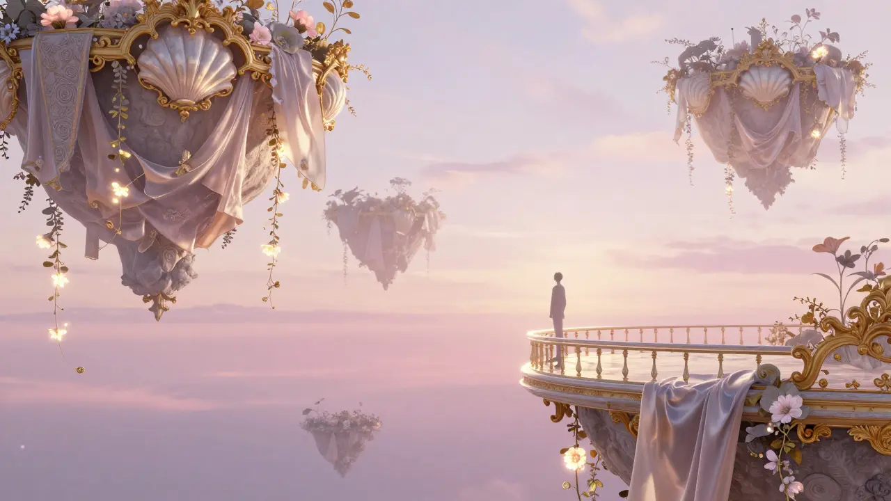
Or check out "Velvet Dreams" a NFT art collection by digital artist Marco Voss that blends Rococo ornamentation with surreal, floating landscapes. The backgrounds look like silk tapestries, but the elements - floating islands, glowing trees - are entirely invented. It’s Rococo, but reimagined for a world that doesn’t need kings.
These artists didn’t study art history to copy. They studied it to understand how beauty was built - and then rebuilt it for their own time.
How to Start
Here’s a simple 3-step starter plan:
- Choose one element - Pick just one: gold detailing, a curved frame, or a pastel sky. Don’t try to do it all.
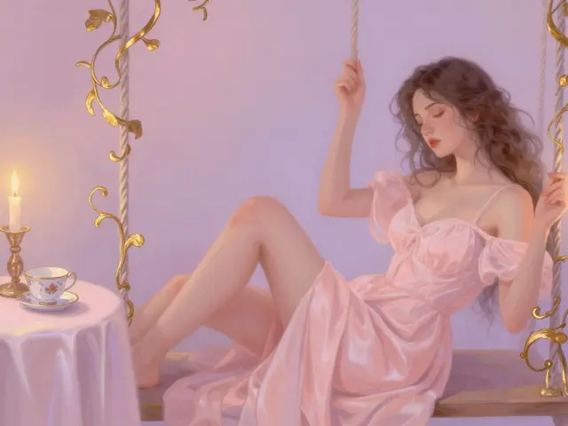
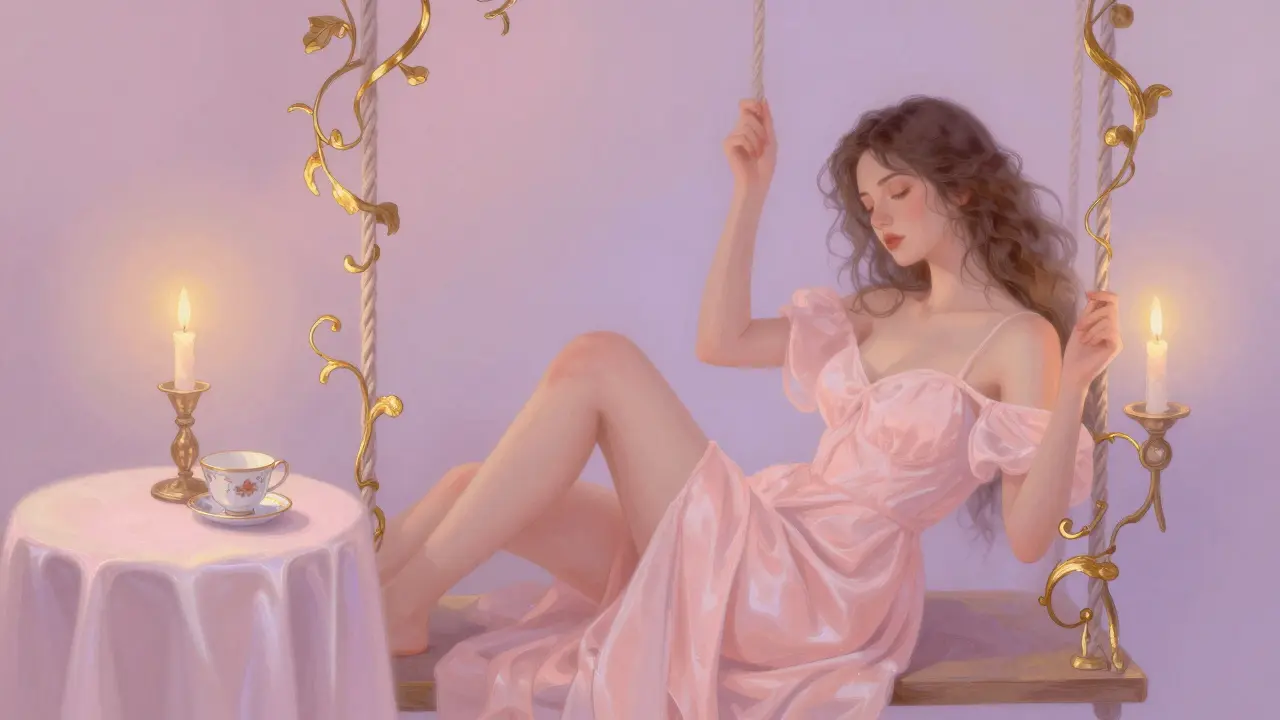
- Study one painting - Pick Fragonard’s The Swing. Zoom in. Notice how the light hits the fabric. How the shadows are barely there. Copy that lighting in your own sketch.
- Make one piece - Just one. A portrait with a vine curling around the edge. A still life with a single porcelain cup. No pressure. Just play.
After that, you’ll start seeing Rococo everywhere - in the curve of a smartphone, the glow of a sunset, the way lace drapes over a windowsill. It’s not a style. It’s a feeling. And you can bring it into your art, no matter what tools you use.
Can Rococo aesthetics work in minimalist digital designs?
Yes - but only if you use it sparingly. Think of it like a single gold thread in a black sweater. A curved border on a button, a soft pastel highlight on a text box, or a subtle vine pattern in the corner of a loading screen. The contrast makes it pop. Minimalism doesn’t mean empty - it means intentional. Rococo adds soul without clutter.
Do I need to learn traditional painting to recreate Rococo digitally?
No. But studying traditional Rococo paintings helps. You don’t need to paint with oil on canvas, but you do need to understand how light behaves on silk, how gold leaf reflects differently than metallic paint, and why asymmetry feels more natural than symmetry. These are visual truths - not techniques. You can learn them by looking, not by mixing pigments.
Is Rococo only for feminine or romantic themes?
Not at all. While it’s often associated with femininity, Rococo was also used in men’s private spaces - study rooms, libraries, even gaming parlors. A digital piece showing a gentleman in a velvet coat surrounded by swirling bookshelves with gold inlays? That’s Rococo too. It’s about texture, light, and elegance - not gender.
Can I use Rococo in UI/UX design?
Absolutely - and some apps already do. Luxury brands like Chanel and Hermès use soft curves and gold accents in their mobile interfaces. Think of a wellness app with a pastel background, a gently curved progress bar, and a subtle shell icon. It’s not about decoration - it’s about creating a feeling of calm and care. Rococo was designed to soothe. That’s still powerful today.
What’s the biggest difference between Rococo and Baroque?
Baroque is loud. It’s dramatic, symmetrical, and meant to overwhelm - think grand cathedrals and towering statues. Rococo is quiet. It’s intimate, asymmetrical, and meant to invite - think a private salon with a single candle. Baroque says, "Look at me." Rococo whispers, "Come closer." In digital art, that difference is everything.
If you’ve ever scrolled through a gallery of digital portraits and felt like something was missing - like it was too sharp, too clean, too cold - now you know what’s missing. It’s the whisper of silk. The glow of candlelight. The quiet elegance of a world that believed beauty was worth the effort. You don’t need to be a historian to bring that back. Just start with one curve. One glimmer. And let the rest follow.