Understanding the Grandeur of Baroque Architecture
Ah, Baroque architecture! It's the kind of thing that can make even a stoic turn their head in awe and a cynic appreciate the finer things in life. Dive into the rabbit hole of Baroque architecture with me, and you might just find yourself swept up in all its grandeur and dramatic flair. It’s like walking into your grandma’s house and realizing it’s actually a palace, with every nook and cranny screaming drama and luxury. Just imagine buildings throwing tantrums such as "Look at me! Aren't I grand?" and you've basically got the gist.
Now, I'll have you know that the term 'Baroque' itself is somewhat controversial. It’s said to have originated from the Portuguese word 'barroco', which means 'a misshapen pearl'. Isn’t that just a poetic way of saying it’s the odd one out? But let me tell you, this 'odd one out' became quite the trendsetter back in the 17th century, especially in Europe. Churches, palaces, and even town squares got caught up in this style, and it was like the whole continent decided that more is more, swept away by this wave of artistic rebellion against the minimalist mantra of the Renaissance. Thank goodness for that, because otherwise architecture would be like toast without butter – utterly bland!
Baroque's Theatrical Impact on Modern Architecture
Nowadays, when you wander around the concrete jungles of today’s world, you might think Baroque has retreated into the shadows of history. But, oh, how wrong you'd be! Just when you think it's all about glass and steel, Baroque pops up in the most unexpected crevices of modern designs. It’s like that moment when you spot a vintage hat at a party - it just makes your head turn. Baroque details in today’s buildings are like Easter eggs hidden by architects for you to find – curved windows here, a grand staircase there.
Lydia and I once had a debate over why Baroque has stood the test of time in modern architecture. She posited that Baroque is like the earworm of the design world—you can’t just shake it off. It embeds itself in your psyche because it's bold, it's brash, and it grabs your attention. And she's not wrong! You can see elements of Baroque flair even in the minimalism-loving 21st century. It's the cherry on top, the flourish that turns a building from 'meh' to 'wow'! When you spot an interesting building during your commute, chances are, it's the Baroque essence waving at you from behind its modern facade.
The Signature Elements of Baroque That Live On
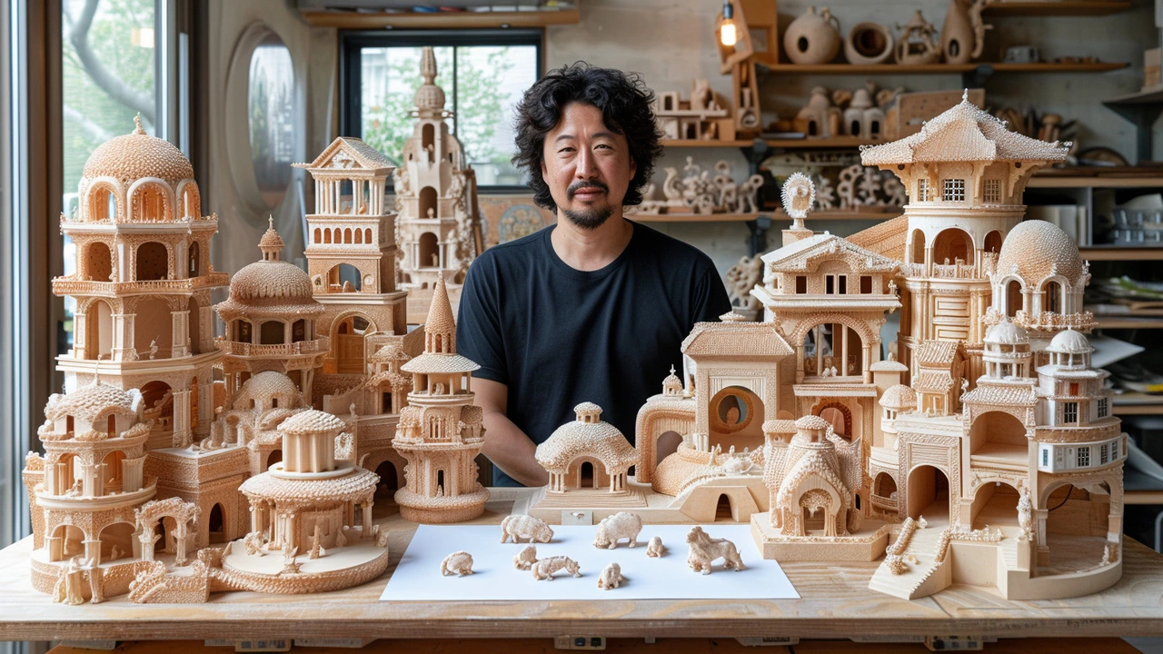
Hold on to your seats because we're about to zoom in on what makes Baroque so distinctively Baroque. Imagine a visual symphony, if you will, where every element has a solo moment. The melody begins with curved lines - there’s hardly a straight edge in sight. Next, the drama intensifies with ornate decorations that are so intricate you’d need a magnifying glass to see all the details. Columns and domes? They’re bulked up like they've been religiously hitting the gym!
Then there's the obsession with light and shadow that Baroque architects had. They treated natural light like a prized possession, creating spaces where it could dance and playfully cast shadows that bring a static room to life. It’s like the room itself is telling stories with light as its narrator. And don’t even get me started on frescoes! They’re not just paintings on a ceiling; they’re epic blockbusters designed to make your jaw drop. It’s like Michelangelo's Sistine Chapel – you just try having a dull moment with all that drama overhead.
Incorporating Baroque Vigor into Modern Homes
So you fancy a bit of Baroque flamboyance in your home, but how do you do that without it looking like you’ve time-traveled? It's a fine line between tasteful homage and living in a time capsule. Now, I believe in taking the spice of life that is variety quite seriously, which means mixing the old with the new—like serving french fries with your grandma’s secret gravy. It’s unexpected, but it’s a match made in heaven.
Start with something simple: a Baroque-style mirror with intricate frames, perhaps. Lydia did exactly that for our Wellington abode. She found this ornate mirror at a flea market, and boom—it became the statement piece in our living room. It’s like the silent protagonist of the space. Every now and then, throw in some curved furniture that nods to those dramatic Baroque lines or maybe a chandelier with curled metal that looks like it’s doing yoga in slow motion. The trick is to sprinkle, not pour, Baroque elements around your home.
Baroque Public Spaces: An Experiential Journey
Let's step out of our homes for a bit and walk through public spaces that have taken the Baroque style to heart. A modern public building with Baroque influences is an experiential journey, not just a place to pass through. It’s like Disneyland for adults. There are spaces I've visited that transport you to another time, where every corner tells a story, and the journey from point A to B becomes an adventure in itself.
You could be walking into a library, but with a Baroque-inspired design, you’re royalty stepping into your private study. There are examples out there with ceilings that seem to open up to the heavens, staircases that deserve their own photo shoots, and windows that frame the outside world like masterpieces. Picture the New York Public Library—it's got a whiff of Baroque drama and makes you want to whisper even if nobody's around.
The Global Footprint of Baroque Influence
Remember, Baroque wasn't just a European vacation; it went on a world tour. From the Americas to Asia, Baroque architecture made its mark. This was globalization before it became a buzzword. You'll find Baroque ripples in places like the Philippines, where churches are a mishmash of local and Baroque styles, or in Brazil, where you can't walk two blocks without bumping into a Baroque fountain still gushing with old-world charm.
Even here in Wellington, you'll find traces of this European transplant. We’ve got places that throw it back to the Baroque era so well you’d expect a horse-drawn carriage instead of a city bus to roll up. It’s like a well-traveled uncle that picked up bits and pieces from everywhere and then decided to drop them off all over the globe.
Resilience of Baroque in the Face of Modernism
Odds are, someone’s going to point out that Modernism and Baroque are arch-nemeses in the world of architecture. Modernism was like, "Let's strip everything back," while Baroque was still putting on the ritz. But here's the twist: Baroque's resilience is its very ability to inject vitality into the sterilized lines of Modernism. It's like when you throw a splash of neon into a monotone painting – it just pops.
Modern structures, at times, feel like they could use some of that Baroque soul—a bit of ornamentation to break up the monolith, some playful curves, or a grand entrance that feels like a warm hug. You can’t take all the cold steel and glass; sometimes you need a plush velvet curtain to soften the room. Baroque has mastered the art of the grand gesture, and even the most minimalist of structures can’t help but borrow a page from its book.
Learning from Baroque's Embrace of Innovation
One thing’s for sure, our Baroque ancestors weren’t afraid to try something new. They were the avant-garde architects of their time, playing with materials and forms in ways that made traditionalists clutch their pearls. It’s like they were the Elon Musk of the architecture world, sending buildings to Mars in terms of design ingenuity.
Take the mind-bending staircases that seem to defy gravity, or the use of trompe l’oeil to trick the eye into seeing depth where there is none. It’s this fearless innovation that still resonates today. When architects dare to dream big, they’re channeling that same Baroque spunk that said, "Why not?" to seemingly crazy ideas. Lydia always says that Baroque teaches us to be bold, to push boundaries, and who am I to argue with that? She's a straight shooter when it comes to design.
Baroque's Role in Today’s Sustainability Conversation
With the dire need for sustainable design, it might seem like Baroque and its excesses have no place at the table. But hold your horses, because there’s a lesson to be learned here too. Baroque wasn’t just about opulence; it was also about utilizing local materials and adapting to local conditions. It's like Baroque architects were the original locavores, eating what they could grow in their own backyard, so to speak.
Today’s architects can pick up a thing or two from Baroque's adaptability. By incorporating local materials and craftsmanship into modern designs, buildings can become more sustainable, just like their Baroque forefathers aimed for in their own time. So, while the opulence may be dialed back, the spirit of resourcefulness and making the most of what you have is more relevant than ever.
Embracing Baroque Today: A Personal Tale
I'll let you in on a little secret: I wasn't always a fan of Baroque. There was a time when I thought it was just too much—like someone threw a bunch of design elements into a blender and let it rip. But then, Lydia dragged me (kicking and screaming, mind you) to Italy for our anniversary, and we stumbled into St. Peter's Basilica in Vatican City. Let’s just say it was an architectural awakening for me. I stood there, gawking up at the splendor and realized you don’t just look at Baroque, you experience it.
Imagine this: As I'm standing in the basilica, a beam of light cuts through the dome, illuminating the intricate details and practically setting the marble aglow. It was like the building had come alive and was showing off just for me. From that day on, I’ve been a Baroque enthusiast, looking for ways that these sensibilities can coexist with our modern lives, and let me tell you, it’s been a rewarding quest.
Whether it's a dramatic wallpaper in the dining room or advocating for the use of curves in urban design, Baroque has influenced my perspective on the world around us. It’s a testament to how an architectural style from centuries ago can still rally the troops and lead a charge for timeless beauty and grandeur in design. People, Baroque is not dead; it’s living in the details, and it’s waiting for you to take a second look.


