Expressionist architecture, with its dynamic and emotive forms, has profoundly shaped modern design. This style tells stories through unique structures, merging creativity with functionality. Discover its origins, key influences, famous examples, and essential elements that define this passionate architectural movement.
Vibrant Buildings: How Color, Form, and Light Transform Cities
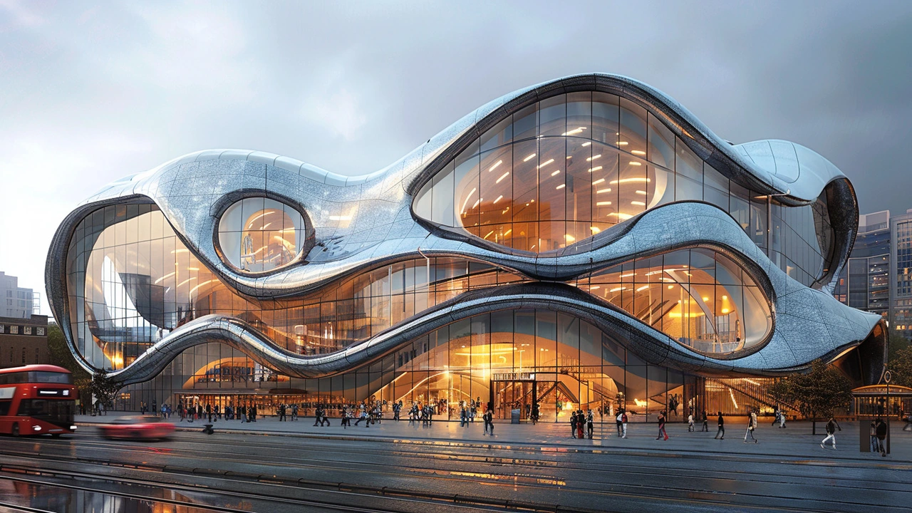
Ever notice how a bright row of houses or a boldly lit museum can lift your mood? Vibrant buildings do more than look pretty. They shape how we move, meet, and feel in a neighborhood. This page collects ideas and examples that show how color, texture, and light turn ordinary structures into places people want to be.
What makes a building feel vibrant?
Color is the fastest signal. A splash of orange, a painted cornice, or a patterned tile can create instant energy. But color alone isn’t enough: contrast, materials, and rhythm matter. Think of a façade with colorful metal panels, deep shadow lines, and glass that reflects the sky. That mix of surfaces creates movement. Scale counts too — large murals read differently from painted trim on a home.
Lighting is the amplifier. Daytime color works, but well-placed lighting extends impact into the evening. LED strips in coves, uplights on ornament, and backlit signage let a building keep its presence after dark. Texture and detail give your eye a reason to stay. Stone, tile, ribbed metal, and terracotta all catch light differently and add richness.
Quick ways to spot vibrant buildings
Look for buildings that combine at least two of these elements: bold palette, varied materials, rhythmic repetition, and clear contrast with surroundings. For example, Beaux-Arts mansions use ornate shapes and sunlight-catching stone to feel dramatic, while high-tech glass-and-steel towers use reflective skin and internal lighting for sleek vibrancy. Neo-futurist projects lean on sweeping forms and high-contrast cladding to feel energetic. Each style gives vibrancy a different personality.
Context matters. A colorful building in an otherwise muted street will pop. In a lively district, subtle color accents may be all that’s needed. Also notice how seasonal changes affect vibrancy: green foliage softens bright facades, while winter light can make warm tones glow.
Practical tips to make a building feel vibrant
1) Start small: paint an entrance or trim before committing to a full façade. A bold door color or window frame can change perception without major cost.
2) Mix materials: pair smooth paint with textured tiles or metal panels. The contrast adds depth and keeps maintenance manageable—use durable finishes where wear is highest.
3) Use lighting deliberately: highlight features, not the whole wall. Uplights on columns or soft washes across murals create drama without glare.
4) Consider scale and pattern: large geometric panels read well from a distance; fine decoration rewards close-up viewing. Match pattern size to the street perspective.
5) Respect the neighborhood: vibrant doesn’t mean random. Choose colors and forms that respond to nearby buildings, climate, and culture.
Want examples? Our site covers styles that deliver vibrancy in different ways — from Baroque drama to high-tech shine and Mediterranean warmth. Browse case studies and pick ideas that fit your street, budget, and taste. A few smart choices can turn a plain block into a place people remember.